Project Plan
We have set ourselves certain deadlines in order to achieve a great results. We have had to make a new time plan aswell due to creating a new storyline and having to start up the filming again.
Poster first draft: 10/03/2011 - finished
Website first draft: 12/03/2011 - finished
First cut- 22/03/2011 - finished
Teaser feedback- 25/03/2011 - finished
Final Drafts of poster & website: 28/03/2011 - finished
Final teaser- 02/04/2011 - finished
Evaluation- 27/04/2011
Having a tight schedule meant that we had to work together efficiently in order to manage our time and use the time effectively to complete everything. I have managed to create my final poster and website, as well as manage to complete my teaser trailer. This was successful as I managed to do this just before the deadline. I will now have to work on my evaluation.
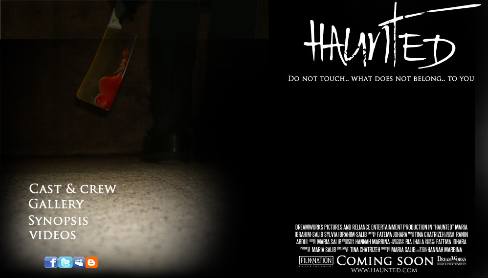
Final website
This is an image of what my final website will look like after finishing the design on adobe photoshop. This website is very similar to my poster with the same prop used as the main image. I have also used the same fonts such as rat infested. I have included many conventions of a website of which include a dateline of the released film date, a billing box, and the distributors logo. I have made sure to include links to other social networking websites for such as facebook or twitter as this increases the publicity for my film and will appeal to a wider audience.
Final Draft teaser
After receiving all the positive and negative feedback, we managed to look back at our trailer and edit it and improve it. From looking at our past draft of the trailer, we found that the clip from 00:13 was a larger size therefore we logged and captured this clip so that it was the same size as the rest of the trailer. We also found that we used too many effects so we took a blink effect off from the clip with the staircase scene and used a simple light effect called strobe. We also changed the ending of which included the title and the dateline as we thought it looked a bit simple, so we added a red outline to it as this represented blood.
Final Draft poster

This is the final draft of my poster and I feel that it looks good. I have followed many codes and conventions of other film posters as this has helped my own poster to look successful. I have included a title, tag line, billing box, date line, distributor logo, and website onto my poster. The title has been placed beneath the main image and I have made sure that it is bold to appeal to the viewers. The tag line I came up with will be able to appeal to the audience as they would want to ask themselves what this could stand for. Also, the tagline relates to the first few seconds of the trailer therefore this may be of an interest to the viewers. I have taken up the feedback from my poster draft and worked on it in order to improve it and make it look much better.


First draft website
This is my first draft of the website. I decided to get feedback on this as I felt that it did not look too good therefore negative feedback would have been very useful. The feedback I recieved included that the main image itself had different shadings and the layers were not set properly therefore I had to change this on adobe photoshop. I recieved positive feedback about the whole side on the right including the title, tag line, billing box, and so on. The font used on the left for the navigator buttons such as cast and crew, gallery, synopsis, and videos, was effective as well as this being the same font used already therefore meaning that I was using a good amount of fonts, however the colour white was not too appealing against the bright image therefore I will change this to black. Also, the audience felt that the social networking buttons were just placed randomly therefore I will move them on the right side in a more appropriate space.
First Draft poster

This is my first draft of my poster. I have asked for feedback in order to improve it and to see if I have chosen an effective image as well as fonts. Feedback received stated that the font used was effective however it did not really suit the poster. The image used was very effective especially with the knife as this related to the there of horror and the audience would want to find out more. I will edit this draft by changing the font and seeing what I can do to make it look more effective. Also, as I have added a blur on the background, I will take this off to see if the normal image looked better as it was.
Subscribe to:
Posts (Atom)